I am a media arts student who works in information security.
Coming out of high school I knew I was going into the military. I didn't know a lot about myself back then, but I knew that if I went to college it would be a waste of my parents money. Once I completed my service in the Navy, I decided that I was going to go straight into the workforce. I mean who wouldn't want a fresh military veteran with six years of experience working on electronics instead of some wet behind the ears kid fresh out of college. So I naively entered the workforce and things didn't go exactly as I planned as far as landing a job, but I eventually worked my way up the IT ladder to the security position I currently hold.
During that climb I did make the decision to apply for college on a part-time basis. I had paid into the GI Bill so there was no reason not to. One class a semester was easy enough, but likely meant I wouldn't be finishing college in under 20 years. That changed when the government decided to change the way the GI Bill worked. Instead of just getting my classes paid for, I was going to get my classes paid for and extra money each month I was in school. The only catch was that I needed to take over six hours a semester which was roughly three classes. Not exactly easy, but also not impossible.
Initially, when I started taking classes I had decided that I wasn't going to go for a tech degree. I had worked with electronics and IT systems for six years while in the Navy. If I was going to take classes, I wanted to learn something new. I ended up in the media arts degree program.
I don't regret the choice.
I would love to have a tech degree for career advancement purposes, but most job postings include the 'or education can be substituted with experience' caveat and I have plenty of that. A media arts degree isn't ideal for a technical career and I wouldn't recommend it to anyone, however, I do think it has it's benefits. Attention to detail is something the military taught me and my media arts degree has helped me refine. Every excellent piece of work you see or hear has attention to detail. Every little detail in the work has a purpose and a reason. You might not pick it out, but it's there and can subconsciously elicit enjoyable responses from you, or if there is a lack of attention to detail a piece of work can elicit a negative response from you.
What I'm getting at is presentation, and more specifically presentation within the infosec community. The infosec community has a tough job, not only technically but also in getting people and organization to buy into information security ideas and solutions. Presentation is very important, not only within the community but also outside the community. I don't think the community's presentation is bad, in fact I've seen a lot of good presentations, but I do think it can be improved and I'm hoping that's something I might be able to contribute to.
For example (and the reason for this post):
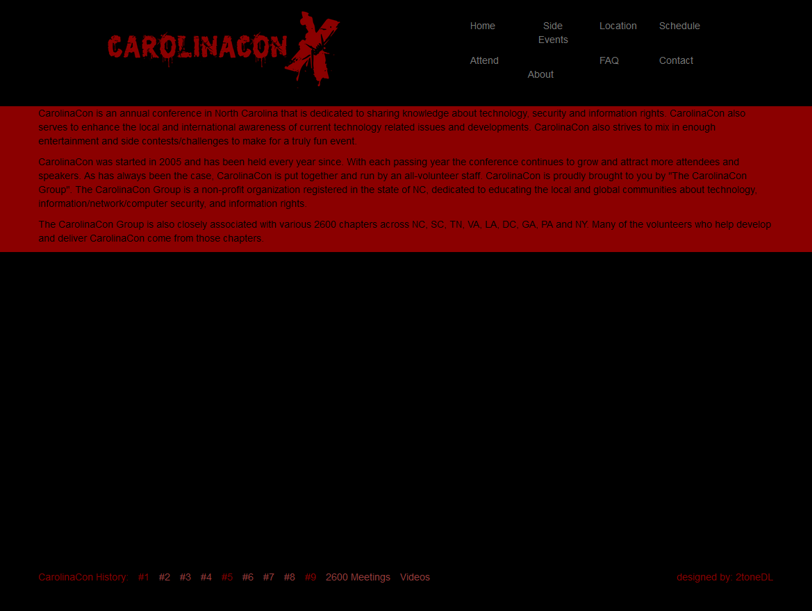
I came across this website from CarolinaCon, a security conference in North Carolina.
Now, before I critique this site I want to make note that I am trying to provide constructive feedback here. I am not calling the creator a dunderhead or the event stupid. I simply think the site can be improved. I absolutely love the logo. I think it's creative and unique to other security conference logos. I even like the colors, but what I don't like is using the colors for the rest of the website. Black on red or red on black or any other dark on dark colors is never a good combination for a website. Same goes for bright on bright colors. Gray on black is also not the best idea, but it's workable. The color scheme is a real eye sore and makes the whole website hard to read.
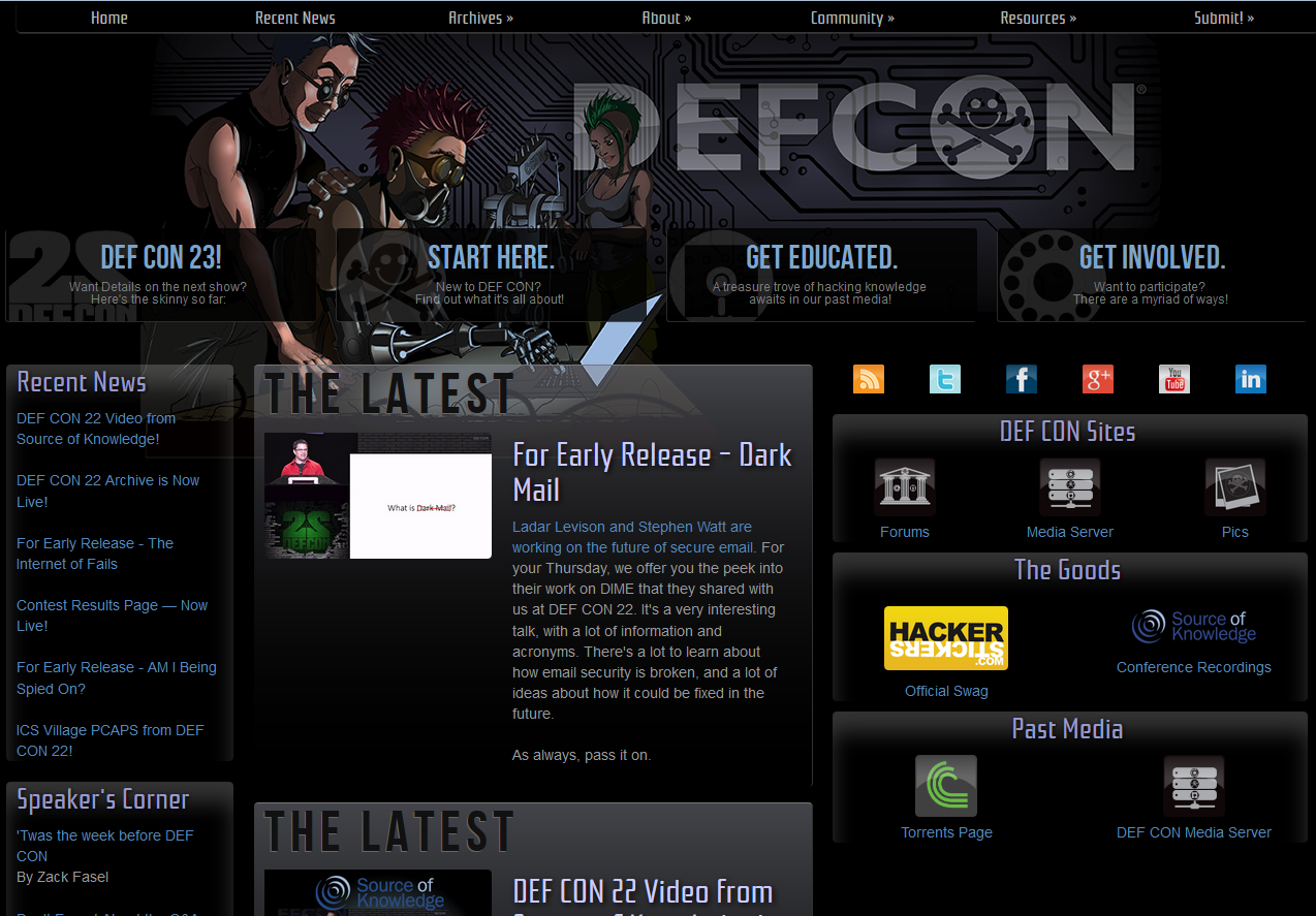
If we look at DefCon's, another security conference, website that uses black for it's background we see that they're using a lot of light blues and light purples. Which is much more pleasing to the eye.
They are using grey, but it's a much lighter grey in most places and the other light colors help balance it out.
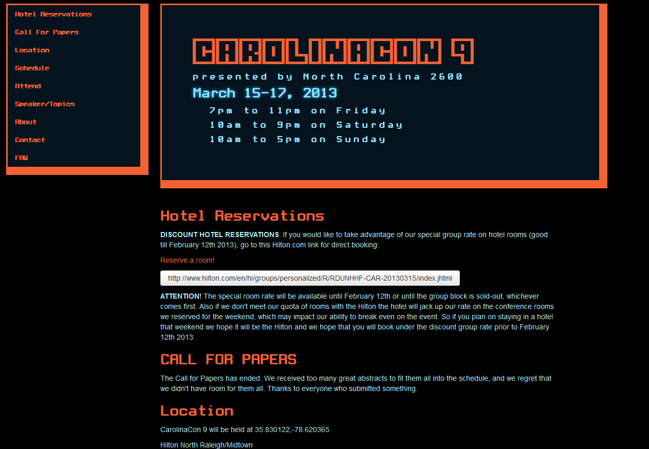
Not to totally rag on CarolinaCon, it has built some pretty good websites in the past. At the bottom of their main page are links to some of the previous iterations of the site. Last years site was pretty good.
The light blue and orange on black is a good combination and the site is much more pleasing to navigate. The 2012 site is also much more pleasing to the eyes.
Like with anything we do in life, how much thought and effort you put into something is what you're going to get out of it. In regards to content you are presenting to others, it's also what other people are going to get out of it. If you want to get your message across, content needs to be created with the viewer in mind. They will essentially get out of it what you put into it. If content is just slapped on then it's going to feel like a slap to the face of the viewer and that can have a negative impact on your message.
Getting a media arts degree probably wasn't the smartest decision I made for my career, but I think I can make some use of it. I hope to do more posts like this that highlight and discuss some of the good and bad things done in presenting the information security message. If you have comments or questions please leave them in the comment section below or contact me directly. I would love to hear your thoughts.
This post first appeared on Exploring Information Security.


