Media arts internship February 18, 2015

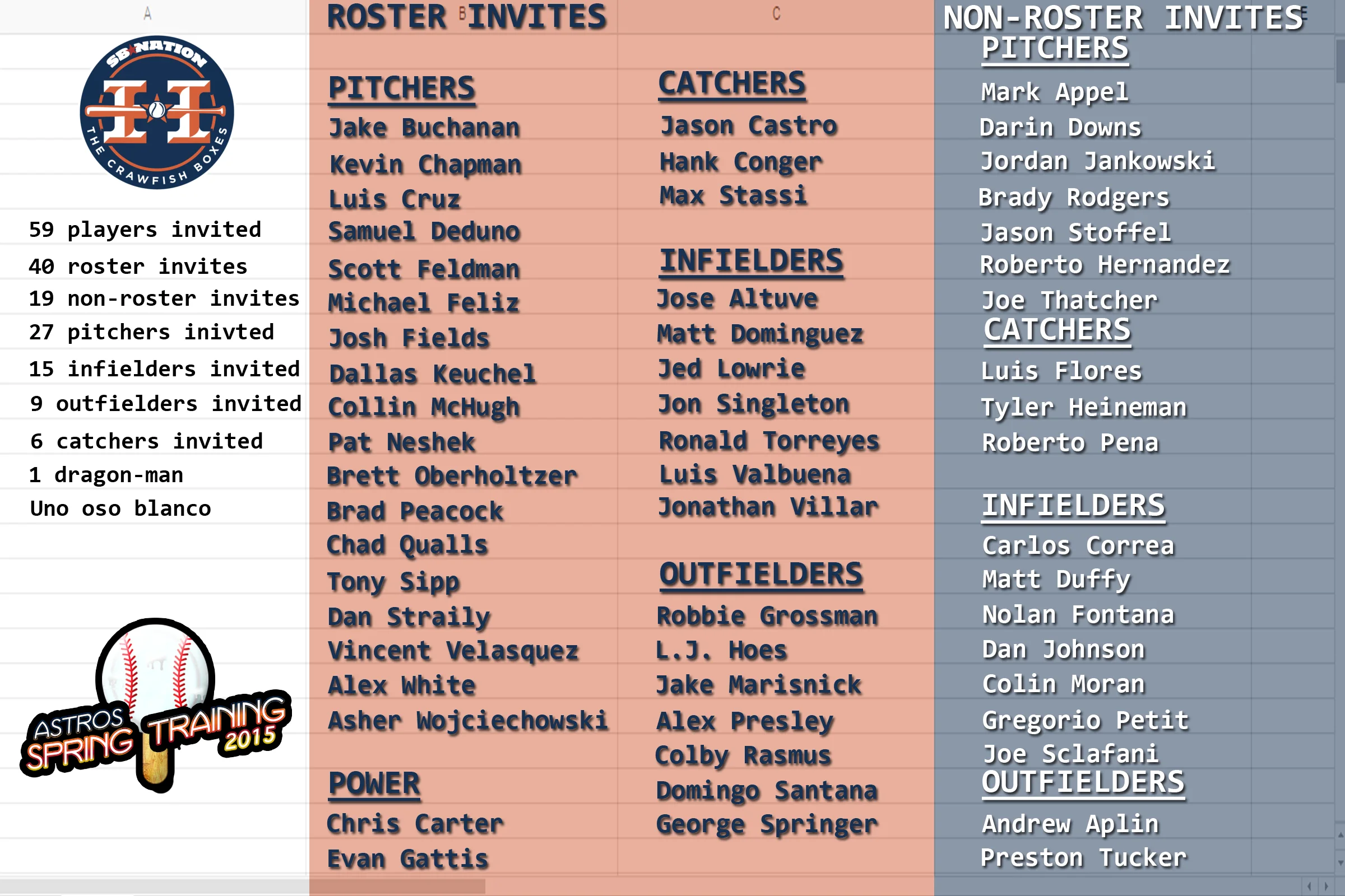
Ryan our graphics designed decided to go ahead and make a graphic for the March Madness logo. I decided that we needed to keep some consistency with the logo so I took out the words and site logo on the one I created and added the word part of his graphic to my background. He really does an excellent job so it only improves upon my graphic, which is fine with me. He also made a generic logo for Spring Training. I took that logo and added it to the bottom left corner of my Spring Training Roster infographic. Here’s what we’ve got for logos now:

I was also asked to make some GIFs for a future article. This is what I made:

Colby Rasmus home run vs. Edison Volquez

Colby Rasmus home run vs. Ubaldo Jimenez

Colby Rasmus home run vs. Ubaldo Jimenez take 2

Colby Rasmus home run vs Gerritt Cole

I’m really starting to like the jump cuts to different angles. I used to do just a single swing, but I think these are better for analysis and make the GIFs more interesting to watch.

Media arts internship February 14, 2015

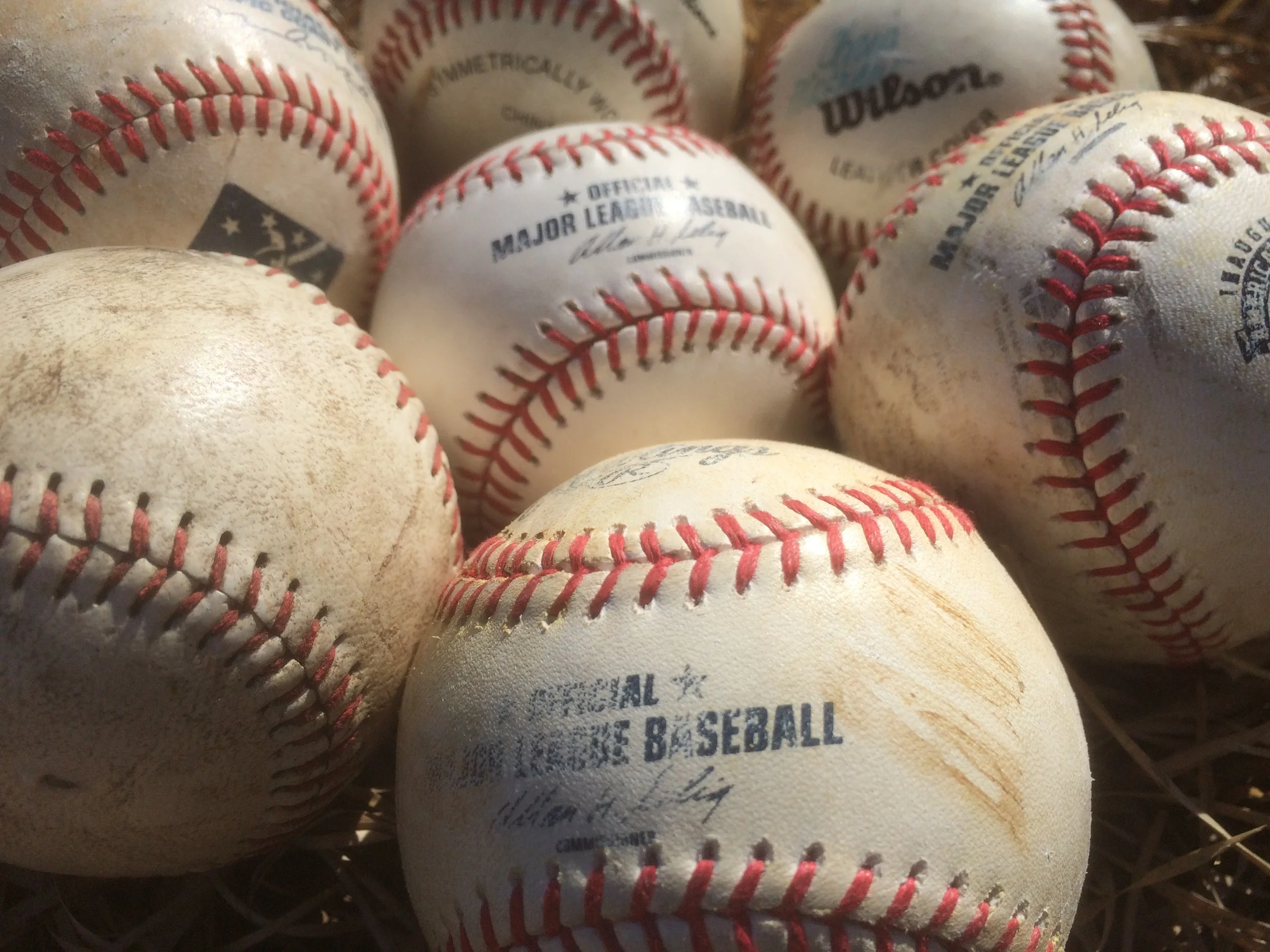
I finished the March Madness logo. It still probably looks like it was done in PowerPoint, but I added some texture to the words. I went outside and took several pictures of balls that we have as memorabilia. I wanted to include grass because I think it makes a great texture.

I finished the March Madness logo. It still probably looks like it was done in PowerPoint, but I added some texture to the words. I went outside and took several pictures of balls that we have as memorabilia. I wanted to include grass because I think it makes a great texture. Here's the final version:

The Astros recently added another veteran player to their Spring Training roster so I had to update the Spring Training roster infographic again. I also worked on the podcast notes for Sunday nights show.

Media arts internship February 13, 2015

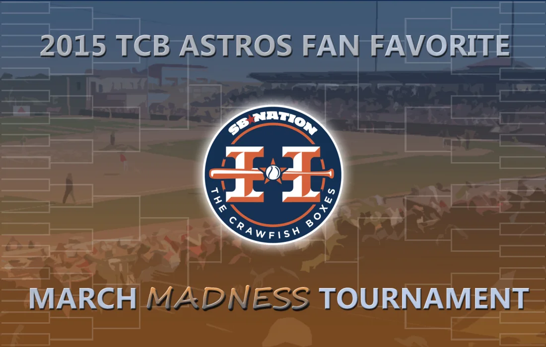
I continued work on the March Madness logo, which I was told looked liked it was created in PowerPoint and was demonstrated to me. So I went back to work trying to un-PowerPoint it. I was given a few sites to review for ideas and I decided to do a little research on Pattern Overlays and textures. Before I did all that though I decided to split up the text and I added a cutout filter to the image behind it to give it a more artistic look. I also added a gradient overlay to the background using the sites blue and orange colors. I then decided to give the word, “madness” a different font and give it a gradient separate from the other words. Here’s what I came up with:

I’d like to add a texture to the rest of the words so I’ll work on that next.

Here are the sites I looked through for inspiration and research:

How to Apply Patter Overlays Using Photoshop Layer Styles - John Shaver - tuts+

Techniques For Creating Custom Textures In Photoshop - Stephen Petrany - Smashing Magazine

dribbble

FFFFOUND!

Media arts internship February 12, 2015

I’m finally home, so I was able to finish the flowchart infographic by adding a couple graphics. I uploaded the new version and added it to the post I had created last week. The post is scheduled for Friday morning.

I’m including the journal log for another hour I did on February 9th, because I did another hour of my internship after I had already logged the hours and written the journal entry. I had planned to include it in the next day’s work, but I got caught up in some other things that kept me from doing any internship hours. Anyways, late in the evening February 9, I decided to gather some ideas for a fun project I wanted to do later in the Spring or even early in the season. The Astros ballpark has a couple goofy elements to it that they’re thinking of changing in the future. One of them being Tal’s hill which is a small hill in centerfield in play. I had the idea of making some changes to the hill in Photoshop and wanted to get some interaction going on the sites Twitter account, so I asked our followers, “what changes they would make to Tal’s Hill.” I’ll take those ideas and do some Photoshop work to Tal’s hill. Except that our graphics designer Ryan saw what I asked on Twitter and started to Photoshop some of those ideas. Here is what he did.

Some good stuff there. I’ll be adding my own additions to it and creating a post for the site.

The last part of February 12 I spent creating the main logo for our Astros Fan Favorite March Madness Tournament event. Here’s what that looks like.

Kind of plain, but I’m hoping to improve upon it the next few days.

Media arts internship February 9, 2015

I finalized the graphics for both the Spring Training roster and March Madness bracket I created. There are a lot of names on the graphics so I wanted to make sure the alignment was good and that all the player’s names were spelled correctly. I spoke logistics with our graphics designed about the other march madness graphics and some other things. I decided we needed a priority list for graphics so that we had some sort of structure and a way to prioritize what needed to be done.

This will help me identify what I need to be working on and in the event that I’m waiting on something, what I can be working on next. It also helps me map out the next month or so and give me deadlines for getting stuff done. The TBD items are ideas of projects I’d like to do, but don’t have a pressing need to get done.

Finally, I put together our show notes for the next podcast which we have scheduled to record this Sunday. I simply copy the old notes in Google Docs, change the dates and take out all the previous topics, put in new topics and then share with my co-hosts. I also sometimes go to social media for questions and topic ideas from our listenership. We’re going to go back to a weekly schedule starting this week so the questions will be a big help to fill the time.